Removing Paint to find Your Values – Published Article InsideArt and Streamline Publishing
I wrote an article for Insideart, a Streamline Publication, edited by Christopher Volpe, about Finding your values in a scene you are painting. But instead of adding paint, this is about subtracting paint.
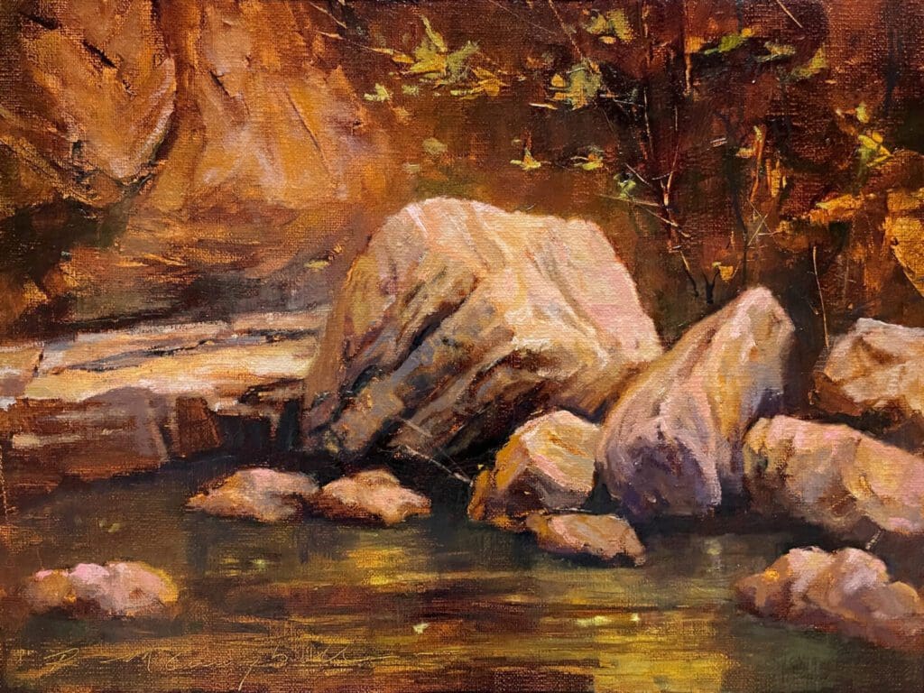
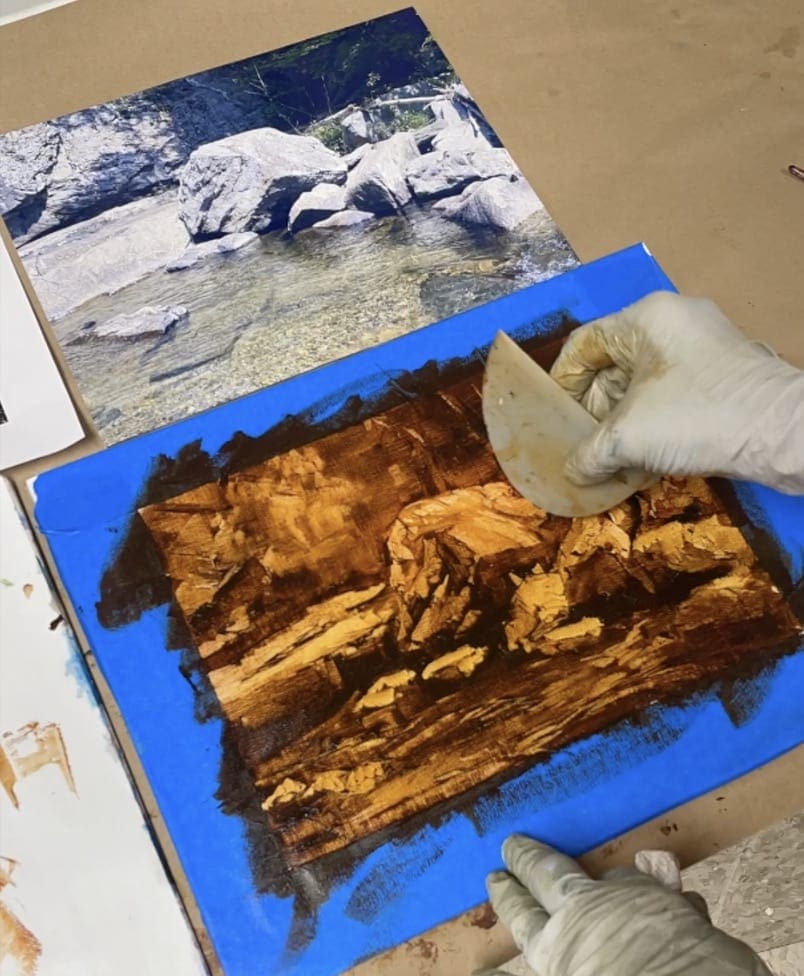
Recently, I was in Vermont for an art symposium and an artist friend, who kindly hosted me and another artist friend for a few days, took us over to a beautiful little falls and trail by her home called Buttermilk Trail….this is where I took this picture for my reference for this value study.
Try this technique that I describe to find a new way to create values. And Happy Painting!
Rachael
Here’s the article:
The Takeaway: Finding Values the Easy Way
There’s an old master’s technique for creating an underpainting that’s both easy and sometimes wonderfully surprising in its own right. It works for both oils and acrylics. Artist Rachael McCampbell walks us through her contemporary version.
When my students are holding a full palette of colors and facing a vast landscape in front of them, they often freeze up, overwhelmed. When this happens, I suggest they try using only two colors — raw umber and white — and a “reductive†(wiping away) process to create a value study. Eliminating the challenges of line drawing and color mixing at the outset puts the focus on the core issues — value and contrast — the heart of successful composition.
Now, many artists compose their values via thumbnail sketches (or notans) using pencils or markers on paper to find the darkest shapes first. I recommend the opposite – laying down a dark tone and wiping out to find the lightest shapes first.
Working backwards like this can result in interesting mark-making and textures that you couldn’t have painted deliberately if you tried. It’s also good for your brain to switch things up; playfulness and experimentation are key to an artist’s growth. It’s also fun to stretch your imagination with different tools, make a mess, and see what emerges from the chaos. I do this exercise in both oil and acrylic.
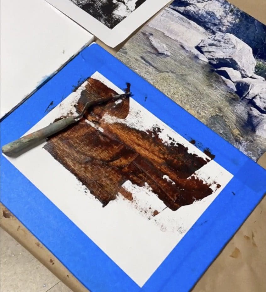
For this oil exercise, I used Centurion Oil paper and transparent colors like Indian yellow, transparent red oxide and asphaltum—all by Gamblin. I chose to use transparent colors because you get a very light staining effect as opposed to a heavy opaque paint that covers more than it stains.
I mixed these three colors together in equal portions and spread the mixture across the paper with a squeegee. Then I began to remove the paint with the squeegee—it’s as simple as that!
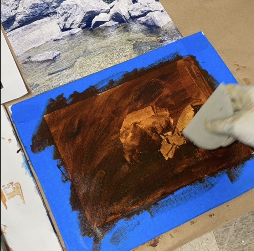
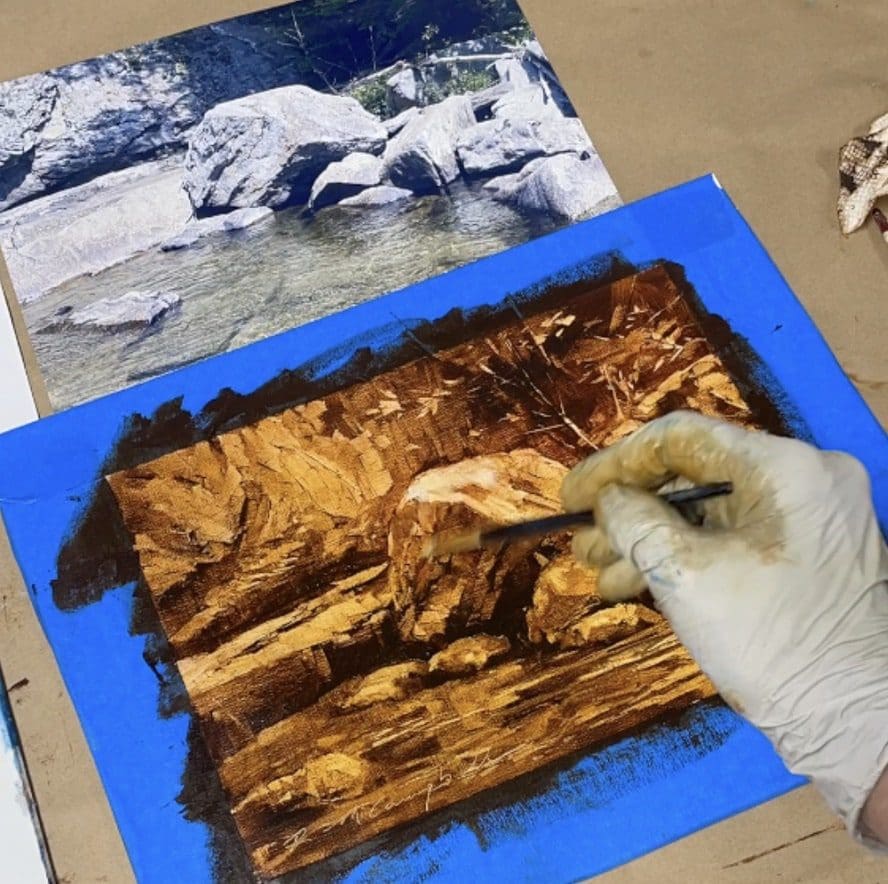
When the paint began to set up, I took a dry brush to it to smooth out some edges. Then at the end, I took some Titanium white, purple and pink to create some highlights on the rocks.
The next day after it had dried, I used more transparent colors (sap green and green gold) because I didn’t want to obliterate the value study beneath it. I only wanted to glaze over parts of it to add a hint of color.
Using Acrylics as an Alternative
Since acrylics dry so fast, you can use GOLDEN OPEN acrylics—they stay wet for hours giving you plenty of time to play. First, take GOLDEN’S Hard Molding Paste and cover a substrate using a squeegee or palette knife (illustration board, canvas panel etc. ) and let it dry for 24 hours. This gives you a nice slick surface with some interesting texture marks.
Then mix GOLDEN OPEN Acrylics Raw Umber and Quinacridone Nichol Azo Gold together in equal parts. Cover the substrate and then begin to remove the paint lightly, in thin layers. It will stay wet for hours but begins to get sticker and more tacky over time.
I encourage value study exercises to simplify a complicated landscape, loosen you up, and stay fresh. My students love it because it opens new doors and gets them out of their analytical minds and often out of a rut they might be in with their work.
By using different materials and tools, reducing instead of adding paint and playing with very
little expectation, fun things will begin to happen with your art and you will be surprised in ways that you never would have predicted. Happy painting!
Tools I used:
OILS:
Centurian Canvas Panel Pad, 9 x 12â€
Gamblin oil colors: Transparent Red Oxide, Indian yellow, Asphaltum, Titanium White,
Dioxazine Purple, Radiant Magenta, Sap Green and Green Gold.
Gamblin Galkyd Lite and Gamsol
Palette paper, blue painters tape, a squeegee, palette knife, paper towels, small brushes, brush cleaner
ACRYLICS:
GOLDEN “OPEN†acrylic: Two tubes: 37ml tube Raw Umber and Quinacridone Nichol Azo
Gold,
Palette or piece of palette paper (or waxed paper taped to the table)
Palette knife to mix
Illustration board (or an art panel, something stiff)
Golden Hard Molding Paste, Squeegee, Brushes, Spray bottle with water, Q-Tips (optional),
paper towels
Rachael McCampbell shares her plein air painting techniques in workshops in the U.S. and abroad.